CIVIC TECH
ELECCIONES
.gif)
2026
Reorganizing Peru's election data around political parties.
SCROLL DOWN ↓
CIVIC TECH
Reorganizing Peru's election data around political parties.
SCROLL DOWN ↓
01. CONTEXT
36 political parties. 35 presidential candidates. More than 5,000 people were running for office, including senators and deputies for the first time in over 30 years.
The numbers aren't the hard part. In the last decade, Peru has had 8 presidents. 4 are currently in prison.
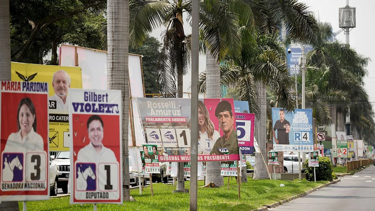
In a country where trust in politics had already collapsed, how does a voter make an informed choice?
02. PROBLEM
The official platform wasn't built for that. It let users search profiles one by one — useful if you already knew who you were looking for.
But it couldn't answer the questions that matter at the party level: How many people on this slate have criminal records? What do they collectively stand for?
The official AI assistant could summarize a CV. It couldn't surface a pattern.
03. THE SHIFT
Instead of organizing information around individuals, the platform reorganizes public election data around political parties. The goal wasn't to tell voters what to think. It was to make collective patterns visible.
Not just who a candidate claims to be, but what a party looks like when you examine all of them together.
04. THE INTERFACE
The challenge wasn't helping experts dig deeper. It was making 36 parties and thousands of candidates feel understandable to someone opening the platform for the first time.
The platform was designed around orientation and comparison. Information is layered progressively rather than shown all at once. The interface needed to organize information, not compete with it.
05. THE BUILD
The biggest challenge wasn't collecting information, but making it comparable. Government plans arrived in inconsistent formats, with missing fields and structures that broke side-by-side evaluation.
Everything was reorganized around political parties first. Plans were standardized into a shared structure so voters could compare objectives, metrics, and records in a single interface.
The database architecture ultimately shaped the product itself. How the information was structured became inseparable from how understandable it felt.
06. THE TRADEOFFS
The harder challenge was restraint. If I highlighted one metric over another, it changed how a voter read the platform. My solution was to interfere as little as possible: preserve the source material, reorganize it, and let voters draw their own conclusions. There were also constant tradeoffs between speed, readability, and completeness. More than 5,000 candidates across 36 parties pushed the limits of how much information could exist on screen without overwhelming the experience.
07. THE RESULTS
2
DAYS BEFORE
THE ELECTION
1,843
PEOPLE REACHED
73
SENT DIRECTLY
TO PLATFORM
The platform launched two days before the election, and analytics were not set up in time, so full traffic data is unavailable. Feedback focused on orientation rather than features. Users said it made the election understandable for the first time, and several pointed to party-level summaries as what enabled comparison.
08. THE REFLECTION
The architecture should have come before the interface. Many of the performance problems traced back to early structural decisions. The UI was designed first, then adapted to the data model, when the opposite should have happened.
The other lesson is simpler: set up analytics before launch. The platform went live during an active national election. How many people used it to make a decision is something I'll never fully know.